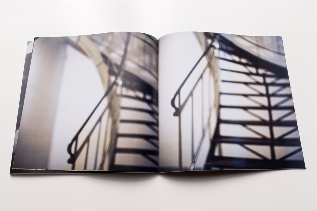
Two frame films
In class, we played a game which allowed us to randomise photos and form diptychs, the way it worked was simple, the two players has a dice and rolled it at the same time, and whatever number you get from the dice you have to take that many images off of the stack in front of you, this resulted in random diptychs being formed, after the first pair of players finished, it was my turn to play the game. We decided to change some things about the way we played the game, leaving 3 seconds to let the viewer see the diptychs, and being more controlled in the way the game was played.
These diptychs were random images given to me and I chose the paired images.

|

|
|
I chose to put these two photos together as diptychs because they are both pictures of what seems to be a road, which is wet and is reflecting in both photos, the photo on the left is different to that on the right due to the oil on the water causing a colourful reflection of light, and the photo on the right has a subject. which appears to be a plastic of some kind. therefore both photos have hints of pollution and global warming.

I paired these two photos together because at the same time as both being buildings, they are contrast each other nicely as the photo on the left has lighter tones and clean looking houses, in contrast to the photo on the right which is darker and appears more run down at first glance, but when I took a closer look I could see signs of street art on the wall which opposes the simple and normal buildings on the left, this is why I put these photos together as they are both buildings and therefore fit into the same category but are so different at the same time.
|
I paired these two photos together because the photo on the left is entirely blue, cold tones without much contrast, therefore pairing it with a photo which contrasts the blues with a vibrant maroon red and hints of turquoise compliments the left photo. It's also notable that the subject in the left is the exact opposite to that of the right which is the opposite colour and size, making these photos as much as a pair as a clashing combination.

I chose to put these two photos together because they both show signs of neglect and share similar colours, the photo on the left shows the abandoned front of a shop and the right shows the shutter of the front of a shop however in front of the shutter you can see stacks of boxes suggesting that it is possibly left unopened for long periods of time, I first made the decision to pair these due to the similar colours but then came to the realisation that they also share a lot on common.
|
My own diptychs
CHANCE |
|
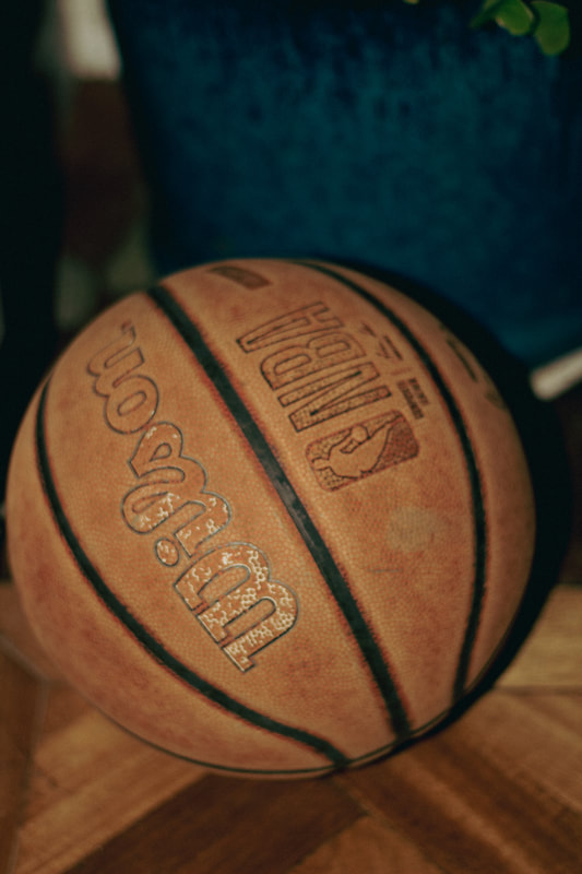
These two photos are both of objects used for hobbies in my family, have a similar colour scheme and are both taken from above, however I did not intend for these two to go together as on paper a basketball and a guitar do not go together however when I saw them next to each other I realised the two photos share a lot in common
|
|
DECIDED |
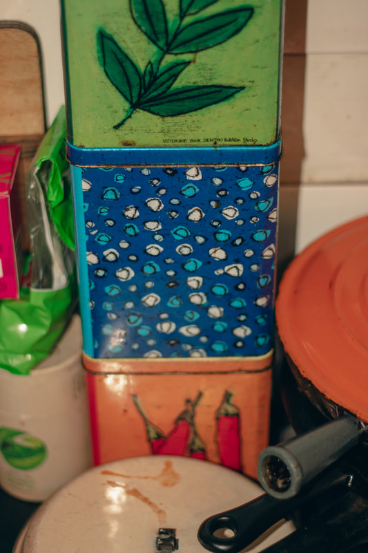
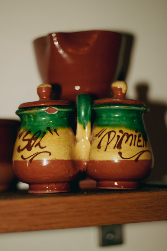
I decided to put these two photos together as diptychs because they are both used for a similar purpose, which is to hold spices and salt, however they are both no longer used. The boxes on the right are newer to the ones on the right which are very old and are from Spain. This is decided as I deliberately took both photos to go together

Luke Fowler, two-frame films. In the first diptych, both images are spaced far apart in time and space, making them seem very random, however upon closer inspection I can see that the broken glass is possibly there to replicate the shape of the mountain. The contrasting colours of red and blue draw the eye to the red first and then forces the observer to take a closer look at the image on the left, leading them to realize that the image is taken from an airplane, contrasting the car on the right image, suggesting that the photographer was on a journey during this photoshoot. Despite the comparisons I have made I can never be sure that these photos were taken by chance or if they were decided as they were taken so far apart in time and space, meaning that all this is a coincidence that the photographer saw similarities in.
In the second diptych, it appears that John MacLean deliberately made these two images into a diptych due to the clear similarities shared due to the location the photos were taken. on the right image, it is entirely black and white, and appears as if it was not edited to be that way, rather the smoke caused the red to be washed out. On the left image I can see colour and that the image was taken from the other side of the wall which we do not see on the right image, the photographer also made both subjects of the image line up in a slightly confusing way as the observer struggles to find what the structure is.
In the second diptych, it appears that John MacLean deliberately made these two images into a diptych due to the clear similarities shared due to the location the photos were taken. on the right image, it is entirely black and white, and appears as if it was not edited to be that way, rather the smoke caused the red to be washed out. On the left image I can see colour and that the image was taken from the other side of the wall which we do not see on the right image, the photographer also made both subjects of the image line up in a slightly confusing way as the observer struggles to find what the structure is.

|

|
I made this diptych with the theme of shadows and reflections, the colours contrast however they were both taken with reflections in mind, but focusing on the foreground, not the reflection itself.
identity?


Since I am at school I had to find a way to capture aspects of my identity through the use of my accessories and clothing, putting emphasis on my rings which I hold sentimental value to, using different lightings to make them seem more aesthetically pleasing as there was a sunset during the photoshoot. I also instructed my classmate on different angles using shadows and sunlight.
Beyond Here Is Nothing from Laura El-Tantawy on Vimeo.
The project was inspired by her peaceful and tranquil view on life around her due to her history and experiences of living in Egypt.


diptychs


These images are both interesting as they are taken at different places at different times of day, however the style of building is reminiscent, and its easy to speculate that the image on the right is a closeup of one of the windows in the left image, however it is not.


I chose to put these photos as diptychs as they both share the same colour scheme, black and red, using the darkness to enhance the deep red lighting, one is a portrait and the other is an image of another camera, suggesting that someone is holding it, therefore both images share more in common than expected.


John Szarkowski - Mirrors and Windows
John Szarkowski was an American photographer and curator who served as a visionary director from 1962 to 1991 as a director of photography at New York's Museum of Modern Art.
In this book he said "I hope to provide a balanced but critically focused view of the art of photography as it has evolved in the United States during the past two decades"
In this book he said "I hope to provide a balanced but critically focused view of the art of photography as it has evolved in the United States during the past two decades"

Mirrors and Windows photos
Mirrors
  |
Both of these images are interesting as at first I was unsure if they were mirrors or windows however I came to the conclusion that they were mirrors, as there is of course the obvious reflections in the image however they also reflect the identity of my friend who was the model for a photoshoot. My counter argument to this would be the fact that the glasses are technically small windows we wear to see the world from a manipulated perspective, usually for functional or medical reasons or for artistic reasons such as fashion to express one's identity.
|
Windows
  |
To me these photos are both windows as they are both images containing windows, overlooking a different landscape to the foreground. on the image to the left, there is a large window behind the silhouetted palm tree, and through the glass we can see a contrasting shade of light and the presence of an urban environment, opposing the nature in the foreground. In the image on the right it is simply an image of skyscrapers however you can see how not all of the windows are lit equally, and each 0ne is a different environment inside. It also shows what is possibly behind the window on the left image, offering an explanation or expansion if looked at from a narrative perspective.
|
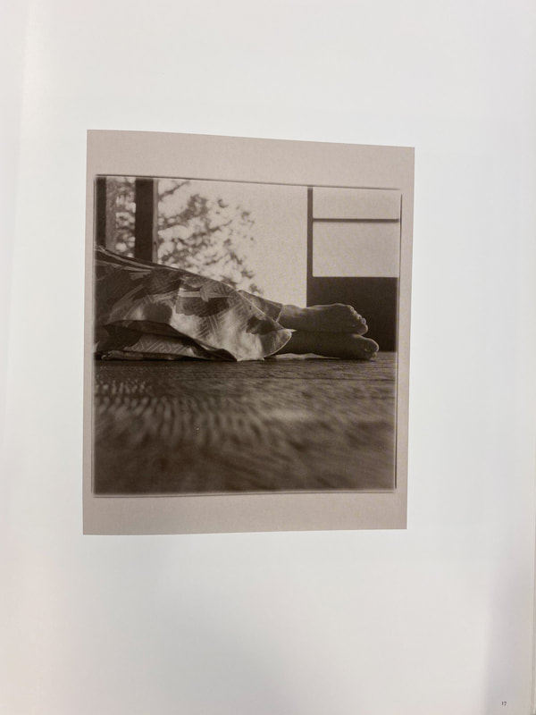
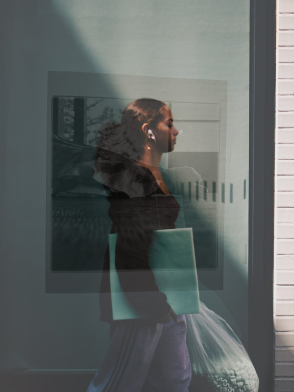
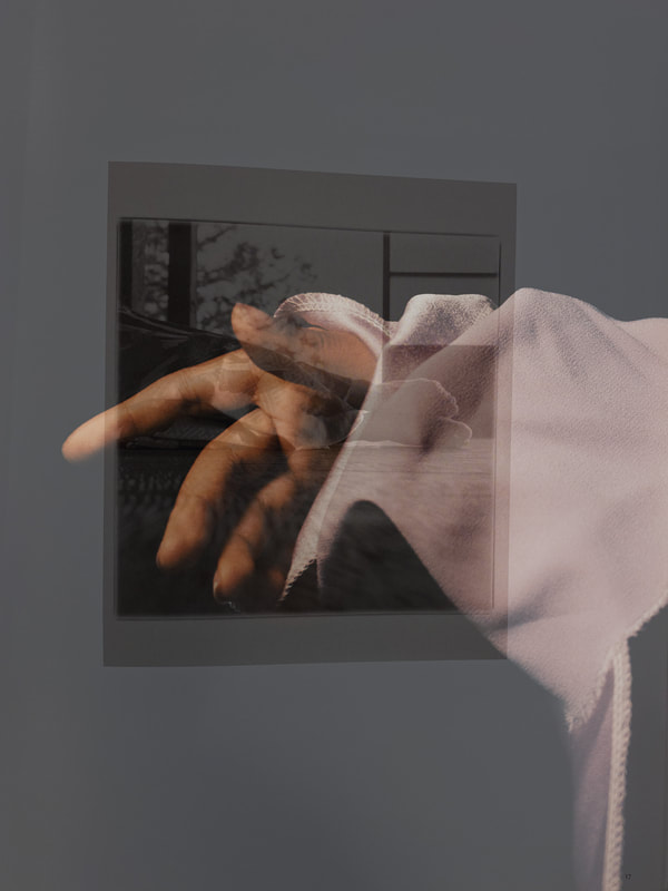
Jiro Takamatsu
Jiro Takamatsu 20 February 1936 – 25 June 1998 was one of the most important postwar Japanese artists. Takamatsu used photography, sculpture, painting, drawing, and performance to fundamentally investigate the philosophical and material conditions of art.

|
For his project, "photograph of photograph" Takamatsu hired a professional photographer to photograph snapshots from his family albums. In each image, the photos in the photos are obscured in some kind of glare, reflection, or shadow, and further distanced by the inclusion of the hired photographer, leaving their captured narratives incomplete and open to reinterpretation. The images are reflections of his identity and is interesting as he chose to hire a photographer to take the photos, and to the photographer they are windows as they do not reflect what type of person or photographer he is?
|
Robert Parkinson
|
Robert Parkinson, a Manchester based photographer, made the "rear window" project during the pandemic, and all of the photos are taken from his back window.
|
Deríve
A dérive (“drifting”), a technique of passage through varied ambiances. Dérives involve playful-constructive behavior and awareness of psychogeographical effects, and are thus quite different from the classic notions of journey or stroll. Part of a subculture which emerged in Paris in the 60's taking a deríve actively rejects consumerist norms of following set pathways by capitalist society, and is where a person or group simply wonders around aimlessly, sometimes documented or not.


THE SUN, SEA AND MOUNTAINS


In these photos I intended to capture images showing off the climate and keep a similar colour scheme throughout the series to evoke a sense of nostalgia I associate with these colours, the bright lighting forced me to change the settings I usually shoot with so that the images weren't overly exposed and I therefore captured intimate details you would usually not notice by simply being there.
CITY OF LIGHTS


These photos were all taken on the same day, in Paris, I combined nature and city in these photos to contrast them. As these photos are from my tourist perspective, I was partly focused on capturing famous landmarks however I was aware of this and therefore also took notice at smaller things, details that I would notice if I was used to the city and anything that stood out to me as interesting, I believe that the contrast between the green and colourful tones contrast the largely washed out yellow tones of the city, therefore it was a good way to show different sides of the city.
Revisiting these photos a while later:
When I uploaded these photos not long after they were taken, the experience was still fresh in my mind, slowly these photos begin to have stronger feelings I associate with them due to the time between the time I took them and now, when I look at them I remember the feelings and moments during and around the time i took them, therefore I look at them in a new light and in some ways I appreciate them more.
SCARTI AND OTHER PHOTOGRAPHERS
Scarti, by the creative duo Adam Broomberg & Oliver Chanarin.
|
The book is, in reality, a collection of accidental mash-ups of overlapping images that first appeared 10 years ago (as single images) in the brilliant, anarchic photobook, Ghetto.
In Ghetto , Broomberg and Chanarin documented 12 contemporary "gated communities" — from a maximum-security prison in South Africa to a psychiatric hospital in Cuba, a retirement home in California, a gypsy ghetto in Macedonia, a refugee camp in Tanzania, and an old people's holiday camp in the USA. They spent a month in each place and the book took over 3 years to make. To me, I really enjoy the double exposures and meanings left for the viewer to decipher, as each image has meanings which take more than a quick look to appreciate and understand. |
|


Hicham Benohoud
|
Hicham Benohoud, a photographer born in 1968, Marrakech, After receiving a baccalaureate degree in the visual arts degree in 1987, he decided to teach at high school level. After teaching for a time, he turned to the profession of visual artist. In 2003, he completed his studies at the Ecole Supérieure des Arts Décoratifs in Strasbourg, France.
With the series La Salle de Classe (Classroom), Hicham Benohoud, inspired by his years as a teacher, developed a photographic approach based upon staging. He borrowed objects from the classroom and used them to portray his models in an unorthodox “décor”. To make them, Benohoud involved the students in his class in a performative project. They were given different physical constraints – specific poses and gestures to adopt – and a range of accessories to wear on their limbs or around their bodies. These accessories included nests of boxes, wire, broken mirrors and large rolls of paper or fabric, evoking a theatre of child psychology and creating a tension between childish games and symbolic violence. |
|


Hicham Benohoud inspired photoshoot
My play on Hicham Benohoud's idea:


In this series of photos, I attempted to incorporate objects found in my school to add unorthodox and aesthetically pleasing elements to otherwise simple portraits to make them more interesting, in some of the photos, I chose to take a creative approach on photographing hands, I used a fabric which looked nice and shot them studio style using contrasting lighting, later editing them fully aware that this is straying from the original idea of reflecting Benohoud's style, however keeping the concept of props and an unusual portrait. I also chose to use natural lighting creatively to accentuate certain shades or colour, for example the bottom centre photo, in this photo I used the lighting to reveal the shade of the bag of foam in a faded way and therefore drawing attention to the curtain and subject therefore creating a very balanced photo equally in form and colour, in my opinion.
Photobook Styles
|
Binding techniques, such as stitching, or Japanese book binding
Include double exposures of people and locations which correlate, for example a simple portrait of a person mixed with an image from the location I was in, done to either reflect the person's mood or mine, or the weather being the dictator of the theme. for my photobook I have looked into different themes and analyzed different photobooks I find interesting, I have also come to the conclusion that firstly I enjoy combining nature with an urban environment but also I specialize in taking portraits in an urban environment, I intend on arranging my pages in a way which will enhance these interests. For example, I believe an interesting way to format my photos in a book would be by making double page landscape photos of a specific place in the same location as a portrait bleeding halfway through the next two pages, adding random text. update: Facades of buildings, and photos of people, the combination of both is interesting to me as they both have a lot in common however a lot which separates them, both are images of the front of someone/ a building, therefore both being "faces" although there is an obvious difference between a building and a person/animal. |
|


Guido Guidi


Guido Guidi (born January 1, 1941) is an Italian photographer. His work, spanning over more than 40 years, has focused in particular on rural and suburban geographies in Italy and Europe. He photographs places that are normally overlooked. His published works include In Between Cities, Guardando a Est, A New Map of Italy and Veramente.
Photo layering

|
|
I chose to use this photo as I think the lighting contrasts nicely to the chance image (from the Sony photography book from 2015) the relatively centred area the image draws you into see is fitting as the image on the right has a subject on the side, whilst my image is a standing portrait.
|
|
Second Deríve


This is the second deríve I have done, and is clearly significantly better than the previous one, I took more time doing it and went to a more interesting place with my camera, as I walked around aimlessly I noticed details in different places for example colour coordination which is a key element I aimed to keep consistent throughout all the images, and using post processing to enhance the lighting in all of the photos. I started the deríve at borough market, and finished it on the bridge at the end, I aimed to make it seem as if the spectator is with me and seeing all the details with me, I took advantage of the lighting to create shadows in many of the photos, however keeping them soft using Lightroom, giving some images an almost dream-like feel, another focus of mine was geometry and composition, using leading lines in the structure of different places, and accentuating them once again using lighting and shadows.
Exploring composition and what I have been doing wrong...
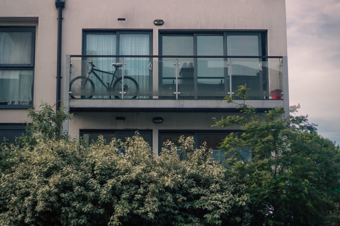
For the majority of my time taking photos, I have relied on cropping and post processing methods to correct composition, which has led me to rarely carefully compose any images, and there's only so much cropping can do to save badly composed images. Through research and generally seeing other photographers' work, I have realised how important it is to have an image you are happy with before any editing is done, as sometimes cropping takes out important spaces of the image, for example, in the photo below, the bike was the focus of the image, however if I had centred that in the image I wouldn't have had the entire balcony in view, and the red bucket and other objects which make it interesting would have been cut off or awkwardly placed, furthermore, I believe that this gives the bicycle more "personality" as it is still the main part of the image but its "home" is in frame.
PORTRAITURE
    |
    |
I realised that recently I had not been practicing my portraiture skills, which is the genre in which I have the most experience in, and over the past few months I have taken many portraits but the majority have been candid or not planned photoshoots, therefore after the deríve I decided to take posed portraits for the first time in a long time, and realized that my composition was good however I could have improved by including less blank space, and more of the subject, however overall I believe these images are great portraits as the lighting, location and colour scheme works perfectly, not to mention the model. I am aiming to include interesting portraits in my photobook and balance them out with the theme of the book.
Indecisive Journey


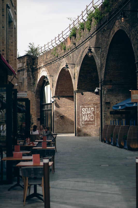
This series of photos, was simply an artistic perspective on an ordinary stroll through central London, in a way it was an adventure as I had no real destination at the time of the photoshoot, what I believe separates these photos to ordinary images of central is that I let myself be drawn to things tourists or people more interested in large landmarks would not be, and chose to photograph interesting and simple details in the city, keeping in mind how they would look in post processing, for example I used the geometry of the architecture in some images to create a strange effect, making the sky seem like a roof, as I noticed how strange the weather was on the day, using bright light hitting the buildings, with a completely flat grey sky in the background creates a sense that this was shot inside, but its clearly outside. I also chose to compose the images creatively by shooting through things and using reflections in some of the images to add layers. I chose to take images of people, and architecture as a primary focus, as they are both significantly varied in their forms.
Robbie Lawrence

I'm interesting in attempting to use the idea of light explored in this book in a similar way for my photobook.
portraiture and landscape


In this set of photos, I continued to explore architecture and portrait photography, shooting with models. I started in the Tate gallery, where I found different sources of lighting to use in my images, for example the projections on to walls and also overhead or wall mounted tinted lights which gave a double shadows and depth to my images. After this, I explored different parts of London which I was drawn to either from the architecture or the lighting, and took photos of both the models and the surroundings. The photos taken from a rooftop were taken towards the end of the shoot, when we saw the opportunity to take advantage of the height to capture the skyline and city light. To me, the rooftop photos are an encapsulation of the feel of the moment because the lighting and colours were mild but striking mainly due to the actual location and models.
this is the final edit settings on a few of these photos^


When I edited this photo, I wanted to find a common ground between an intense landscape edit and a more subtle and flattering portrait edit I apply the the majority of my portrait photography, and during the taking of this image I decided to focus on the background so that I would have less of a focus on editing the subjects to look flattering. In order to achieve the balance in this image I didn't mess with the exposure and lighting settings apart from precise tinkering with shadows and highlights, and instead I focused on the colours and making the photo seem nostalgic more than dramatic.


In this particular photo the original was almost black and white with a slight green tint, I decided to add a green tint and increase the contrast between the subject and background to make him stand out as a silhouette.
The range of people, objects and creatures in London


These are some images that I took in one day of things that drew my attention in London. The theme of "Our Perspective" is to primarily capture all the different things we see in a big city like London, and of thing that many people may see and experience, whilst all viewing it slightly differently either as an individual or a group. This is a photoshoot I did to fit this theme, and I will be adding some of them to my photobook.
Book Wright
Book Wright is the software I am going to use to format and print my photobook, as the quality of the prints is important to me, and it offers creative freedom similar to that of making a book from scratch.
OUR PERSPECTIVE
This is a digital copy of the final photobook I have made, and I am happy with the layout, I used a range of different image sizes and
